
Threshold vs rate-of-change alerting: why the slope catches what the number misses
By Vimal Bhaya, Founder and Lead Systems Architect · Last reviewed 3 September 2026
This is a continuation of The alerting problem, a 5-part tutorial. You are on part 2 of 5.
A threshold asks one question: is the box too warm right now? Rate of change asks a better one: which way is it moving, how fast, and does it come back? Two freezers from our own case studies show why that matters.
- A perfectly healthy freezer reached 22.1°F (-5.5°C) during an ordinary scheduled defrost. Nothing was wrong with it.
- A reefer with its cooling switched off never got past 13.5°F (-10.3°C) in nine and a half hours, with about $125,000 of frozen product inside.
Any alarm number between those two readings goes off on the healthy freezer every day and stays silent on the one in trouble. The slope separates them easily, because the harmless one climbs about thirty times faster and then comes straight back down.
What a slope is, in one paragraph
A thermometer gives you one number: how warm the box is. That number on its own cannot tell you much, because a freezer is supposed to move around a bit.
The slope, or rate of change, is a second number. It is how many degrees the box gained or lost in the last hour. Written down it looks like +0.5°F an hour or -17°F an hour.
Those two numbers answer different questions. The temperature tells you where the freezer is. The slope tells you where it is heading, and how quickly it will get there.
Everything on this page follows from one fact: in refrigeration, the fastest movements are usually the harmless ones.
The proof: the harmless event went higher than the emergency
These are two real units drawn on the same temperature scale. Both come from case studies we publish in full, with the raw readings attached: the Philadelphia freezer failure and the Mississauga reefer no-start.
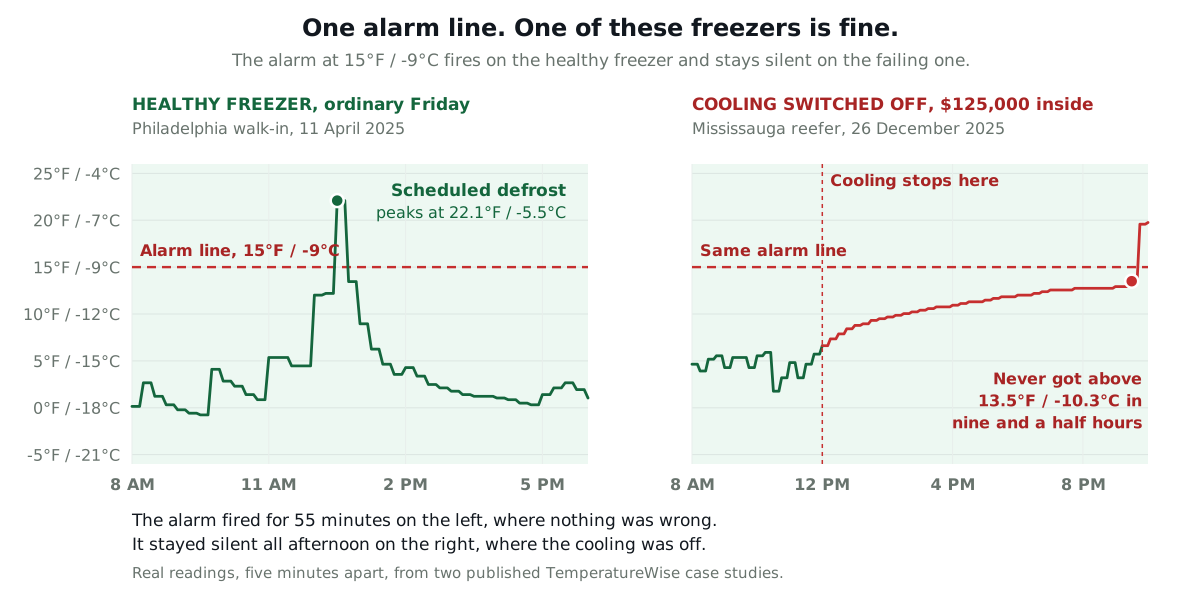
Pick any alarm setting between 14°F (-10°C) and 22°F (-6°C). On the left it goes off during a routine defrost, every day, forever. On the right it says nothing for nine and a half hours while the cooling is off.
That is not a badly chosen number. There is no number that gets both of these right, because the emergency was colder than the false alarm. Height cannot separate them. Only the shape can.
Three shapes, and only one of them is normal
Across the three units we publish full exports for, refrigeration going wrong looks like one of three shapes. Learn these and you can read most freezer charts without any software at all.
- The spike that comes back. Steep, brief, and fully reversed within a few hours. This is a defrost, and it is the freezer working correctly.
- The straight line that never comes back. Slow, smooth, and relentless. The cooling has stopped and nothing is running.
- The floor that creeps up. Normal-looking cycles whose low points drift warmer week after week. The unit is losing capacity and something is wearing out.
The rest of this section takes each one in turn, with the readings behind it.
| What the line does | How fast | Does it come back? | What it means |
|---|---|---|---|
| Jumps up, then drops | +15 to +19°F (+8 to +11°C) an hour | Yes, within a few hours | A defrost. Normal, and scheduled |
| Climbs in a straight line | About +0.5°F (+0.3°C) an hour, for hours | No | The cooling has stopped. Nothing is running |
| Cycles normally, but the low points creep up | +0.4 to +2.3°F (+0.2 to +1.3°C) a day, for weeks | No | The unit is losing capacity. Something is wearing out |
Notice which row has the biggest number in it. The harmless one.
Shape 1: the spike that comes back
A defrost is the freezer deliberately warming its own cooling coil to melt the frost off it. It is meant to happen, several times a day. There is a fuller explanation, and what it does to alarm settings, in why temperature alarms cry wolf.
Here is the same defrost drawn twice: once as temperature, and once as slope.
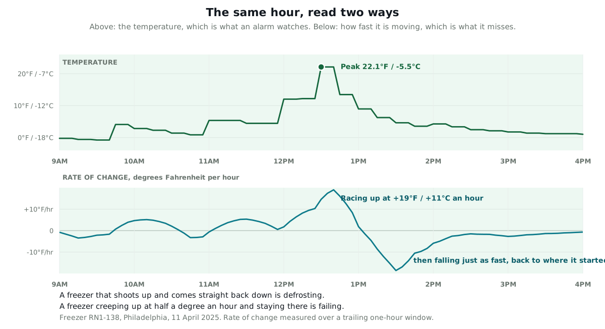
The tell is the second half. The freezer gave all of it back. It was under 0°F (-18°C) again by early evening, without anybody doing anything.
Steep, brief, and reversed is the signature of a healthy freezer doing its job. A system that knows this can stay quiet through every defrost you have, and still shout if the box fails to come back down afterwards.
Shape 2: the straight line that never comes back
On Boxing Day 2025 a stationary reefer at a production site in Mississauga finished an automatic engine-off period and did not restart. A weak battery was the cause, found later. Nobody was on site, because it was the day after Christmas.
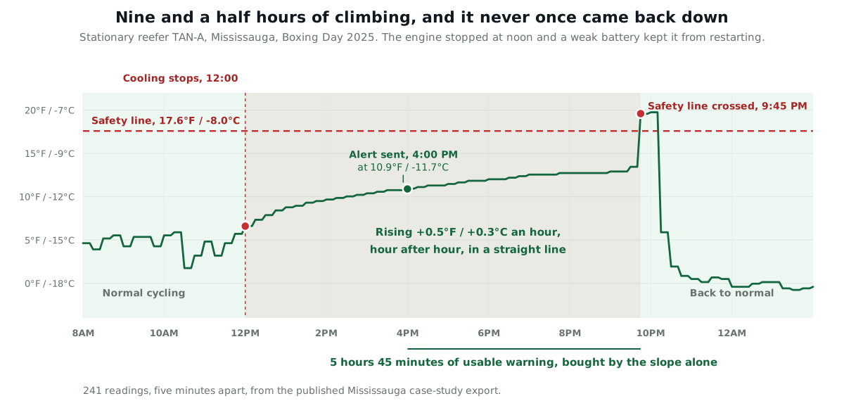
Three things in that trace say the cooling is off rather than struggling, and you can check all three by eye.
- The wobble stopped. A running unit saw-tooths, because the compressor switches on and off. Until 11:45 that morning the trace bounces between about 3 and 6°F (-16 and -14°C). After noon the bouncing stops and the line goes smooth.
- It never once gave anything back. Out of 117 readings taken between noon and half past nine at night, not one was colder than the reading at noon. A unit that is running but weak still pulls down between cycles. This one never did.
- The rate was slow and steady. It rose fastest in the first hour, then settled at about half a degree Fahrenheit an hour, hour after hour. A box with nothing cooling it warms fastest when it is coldest and then eases off, which is exactly what this did.
Put those together and the diagnosis is not really a guess. Something that was cooling has stopped cooling, and it is not going to start again on its own.
What that bought the customer
TemperatureWise alerted the team at 4:00 PM, at 10.9°F (-11.7°C). The trailer did not cross the 17.6°F (-8°C) safety line until 9:45 PM. A threshold set at the safety line would have sent its first message at 9:45 PM, five hours and 45 minutes later, on a public holiday, with up to $125,000 of frozen product inside.
The reefer was restarted at about 10:10 PM and was back near its target within the hour. The full story and the readings are in the Mississauga reefer case study.
Shape 3: the floor that creeps up
The third shape is the slowest and the most valuable, and no alarm setting can see it at all.
Every freezer has a coldest point it reaches each day. Think of it as the unit's best effort. While the equipment is healthy that number stays put. When something starts wearing out, it drifts, long before the box is ever warm enough to worry about.
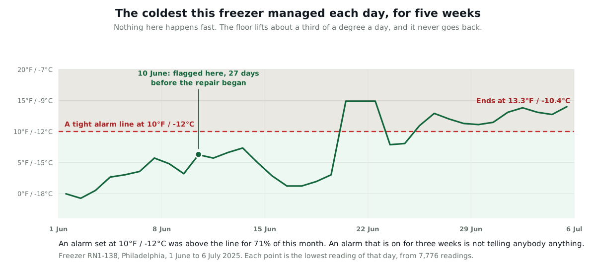
The daily low went from -0.1°F (-17.8°C) in the first days of June to 13.3°F (-10.4°C) by the first days of July. That is about a third of a degree Fahrenheit a day, which is far too slow for anyone to notice by walking past a display.
TemperatureWise flagged it on 10 June, 27 days before the first repair. That time was spent finding a technician, sourcing a hard-to-get fan and bracket, and moving $450,000 of frozen product into a temporary reefer before the final work. The detail is in the dual-system freezer case study.
What a threshold does with each of the three
Set one number and you get one of three outcomes, and which one you get depends on the failure, not on how carefully you picked the number.
- It fires when nothing is wrong. On the healthy Philadelphia freezer, an alarm at 10°F (-12°C) went off for 55 minutes on an ordinary Friday, because of a scheduled defrost.
- It stays silent when everything is wrong. On the Mississauga reefer, a 15°F (-9°C) alarm said nothing at all for nine hours and 45 minutes with the cooling off.
- It gets stuck on. On the dual-system freezer, 5,526 of the 7,776 readings taken between 10 June and 6 July were above 10°F (-12°C). That is 71% of a month. An alarm that has been on for three weeks is not an alarm.
The third one is the least discussed and probably the worst. Nobody mutes an alarm that goes off twice. Everybody mutes one that has been going off since the middle of June.
Being straight about what the slope cannot do
Rate of change is not a replacement for a threshold, and anybody selling it that way is overselling it.
It needs a baseline. The system has to watch your unit for a while before it knows what normal looks like on that box. In the first week or two after installation it has nothing useful to say, and it needs to relearn after a real change like a new compressor.
It is slower to be sure. Look again at the five-week chart above. The daily low was already lifting in the first week of June, before we said anything on the tenth. Waiting is deliberate, because a single busy week of deliveries also lifts the floor, and calling that a fault would be its own kind of crying wolf.
It can be fooled by real events that are not faults. A large warm delivery loaded straight into a walk-in produces a genuine sustained climb. So does a door propped open during a stock take. The slope has to be read against the history of that box, not on its own.
It adds nothing on failures that are instant. A power cut or a compressor that stops dead will trip a plain threshold at roughly the same moment. Keep the threshold. It is the line that says the product is at risk right now, and no amount of pattern watching replaces it.
How to check your own data for this, with no software
If you can export a month of readings from whatever you already have, you can do the useful half of this in a spreadsheet in about ten minutes.
- Take the lowest reading of each day and put those numbers in a column, one row per day.
- Plot it. On healthy equipment that line is flat and boring, and boring is the correct answer.
- If it has lifted by more than a degree or two over a fortnight and has not come back, book the service call now, while you can still choose the date.
- Then look at your worst day. If the peaks are short and reverse within a couple of hours, they are defrosts, not faults.
This will not catch a reefer switching itself off at noon, because that needs somebody watching in the moment. It will catch the slow one, which is the one that costs the most and gives the most warning.
Or have it done for you
The spreadsheet version above is real work, and it only tells you about last month. Somebody has to remember to do it, on every box, forever.
If you would rather not, that is the whole job TemperatureWise does. It watches the slope on every unit continuously, learns what normal looks like on each one, and tells you which of the three shapes it is seeing along with the likely cause and how long you have. Every chart on this page came out of it.
Either way, look at your daily lows. Doing it by hand beats not doing it at all.